
Looking to make your app pop on Google Play? It all starts with designing a powerful app icon that captures attention.
Your icon is the first impression users get in the Play Store — and it needs to stand out. That’s why following the Android app icon guidelines is essential. In this guide, we’ll walk you through everything from icon sizes and shapes to adaptive design principles, helping you create icons that are not only visually appealing but also fully compliant with Play Store standards.
Table of Contents
What Makes Play Store App Icons So Important?
Your app icon is often your only chance to make a great first impression. A well-designed icon doesn’t just grab attention — it directly influences click-through and conversion rates.
In a Play Store crowded with 2 041 007 apps, a clear, visually compelling icon can be the difference between being downloaded or ignored. It’s your app’s visual signature, making it instantly recognizable and memorable in a sea of choices.
It offers users a quick sense of what your app is about, conveys quality, and builds trust. In short, a thoughtful icon isn’t just a design detail — it’s a critical component of your app’s success on the Play Store.
Play Store App Icon Size Guidelines
When designing your app icon artwork, make sure it meets these specifications:
- Dimensions: 512 x 512 pixels
- Icon Format: 32-bit PNG
- Color space: sRGB
- Maximum file size: 1024KB
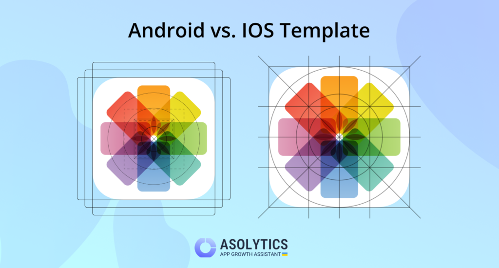
- Shape: Full square (Google Play will automatically apply masking with a corner radius of 20%)
- Shadow: Do not include shadows — Google Play adds them automatically. (Refer to the ‘Shadows’ section if you plan to include them within your design.)
Designing app icons for the Play Store means following strict size requirements to ensure your icon looks clean and sharp across all Android devices. Different screen densities demand various icon sizes — from launcher icons to high-res versions needed for app publishing.
Failing to meet Google’s format and size standards can delay your app’s release. Sticking to the correct specs ensures your icon appears professional and optimized on every device.
Standard Google Play icon sizes
To support multiple screen resolutions, Play Store icons must be created in different Android icon dimensions. Here are the key sizes of the app icon you’ll need:
- 512 × 512 px – Required high-resolution icon for Play Store listing
- 48 × 48 px (MDPI) – Base size (e.g., Moto G Power)
- 72 × 72 px (HDPI) – Medium-density displays (e.g., Samsung Galaxy A12)
- 96 × 96 px (XHDPI) – Higher resolution (e.g., OnePlus Nord N200)
- 144 × 144 px (XXHDPI) – Large pixel density screens (e.g., Redmi Note 10)
- 192 × 192 px (XXXHDPI) – Extra-high-end displays (e.g., Galaxy S21 Ultra)
💡 Use Android Asset Studio to generate all required icon sizes automatically and organize them into resource folders.
Adaptive icons
Introduced in Android 8.0, adaptive icons Android uses two layers — foreground and background — to allow dynamic resizing and shaping across various device UIs.
Why use adaptive icons?
- Foreground layer: Adds detail and branding.
- Background layer: Enhances depth and contrast.
- Dynamic shaping: Adapts the icon’s shape to match the device’s launcher (circle, square, squircle, etc.).
This flexibility ensures your icon remains consistent, stylish, and well-integrated into any Android interface.
To ensure correct rendering across devices, adaptive icons must meet these specs:
- Visible area: 108 × 108 dp — The safe zone for your design to be clearly visible on all screen types.
- Full asset size: 162 × 162 dp — Accommodates the full background and foreground for smooth scaling.
✅ Pro tip: Add a subtle outline or border around your icon to keep it distinct against any background.
How to Design an Eye-Catching App Icon for Google Play
To create an appealing app icon for Google Play, it’s essential to consider some Android icon design tips.
1. Focus on adaptability
Your app icon should be versatile enough to look great across different devices and platforms. It will be viewed in various contexts, so it must remain visually appealing and clear, even against different backgrounds.
2. Prioritize recognizability
A memorable icon is crucial for improving app conversions. Don’t hesitate to experiment with different designs until you find one that stands out from the crowd and captures your attention!
3. Maintain consistent colors
Ensure that the color scheme of your app icon aligns with your app’s overall user interface. This consistency strengthens your app’s branding and makes it visually cohesive.
4. Create a unique design
To differentiate your app from others in the same category, aim for a distinctive design that sets it apart and attracts attention.
5. Create associations with your niche
Incorporate visual elements in your app icon that clearly relate to your app’s niche or theme. For instance, a yoga app might feature imagery such as poses, yoga mats, or even the word “Yoga” itself. Similarly, an audiobook app could include illustrations like book covers, reading-related graphics, or audio symbols to instantly convey its purpose.
Well-established brands are an exception to this approach. If your app is tied to a recognizable brand, showcasing the brand logo alone can be effective, as users are likely to identify the app based on its iconic branding.
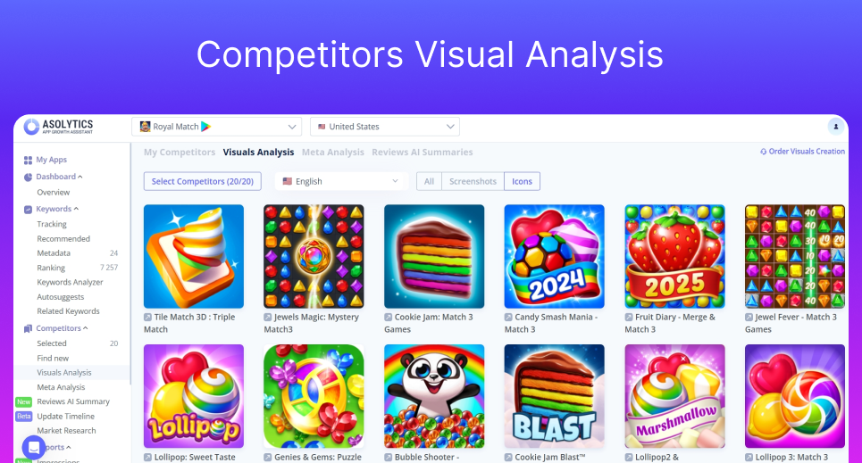
✅Tip: When designing your Android app icon, it’s important to not only follow Play Store standards but also understand how your competitors present themselves visually. Tools like Asolytics make this process easier by offering Competitors Visual Analysis, showing you screenshots and icons from similar apps. By studying these visuals, you can gain valuable insights into common design trends, color schemes, and branding strategies within your niche.
Choosing the right icon style
- Flat icons: Best suited for utility apps, flat icons are simple and practical, making them easy to recognize and understand.
- Skeuomorphic icons: These icons resemble real-world objects and can be ideal if your target audience is familiar with certain physical items.
- Illustrated icons: Perfect for apps that offer an engaging experience, like games or fantasy apps, illustrated icons draw users’ attention through detailed designs.
- 3D icons: For 3D games or apps with interactive, dimensional features, 3D icons offer a dynamic and eye-catching look.
Stay ahead of trends on Google Play
- Google Play users often decide to download apps faster than App Store users. So, it’s vital to make that first impression count! Ensure your icon and content immediately grab their attention.
- Many Google Play users prefer videos to understand your app, so optimize your app video for better conversions.
- The app description is displayed above the screenshots, so it’s important to write a compelling, concise, and engaging description.
Ensure Compliance with Google Play Policies
To adhere to Google Play’s Developer policies, it’s important to avoid using misleading text or graphic elements in your app icon. Do not include promotional phrases like “Best App” or display misleading symbols such as rankings or ratings.
Refrain from incorporating visual elements that imply special offers or discounts, as these could result in your app being rejected or removed from the platform.
Also, avoid using graphics that give the impression of participating in Google Play programs, as this can lead to rejection or negative user experiences. Always consult Google Play’s metadata policies for further guidance. By following these rules, you can create an icon that is both compliant and visually attractive, while maintaining consistency across Google Play.
Tools for Designing Google Play Store App Icons
Choosing the right Android icon design tools is crucial for improving their quality and visual impact.
There are numerous resources available to help developers create eye-catching icons that meet Play Store requirements. To design effective app icons for Play Store, consider using the following tools:
- Android Asset Studio: This tool in Android Studio simplifies the design process by automatically generating the necessary icon sizes. It organizes the icons into the correct mipmap folders — mipmap-mdpi, mipmap-hdpi, mipmap-xhdpi, mipmap-xxhdpi, and mipmap-xxxhdpi — making it easier to integrate them into Android apps.
- Vector images and design software: Software like Adobe Illustrator allows designers to create high-quality vector graphics, which enhance the visual appeal of app icons. Vector images retain their quality at different sizes, ensuring that icons look sharp on a variety of devices. Mastering vector graphics and design tools is essential for creating top-tier app icons that attract users.
✅Tip: When designing vector images for app icons, make sure your design is scalable by using simple shapes and clean lines. This approach ensures that your icon maintains its quality at various sizes and resolutions, keeping it clear and crisp on different devices.
Test and Improve Your App Icon
App icons play a crucial role in app store optimization (ASO), significantly improving conversion rates by catching users’ attention and motivating them to download the app.
To optimize your app icon, make strategic design choices that enhance both its visual appeal and functionality. Here are some ASO strategies to boost your app’s visibility and attractiveness on the Google Play Store:
- A/B Testing:
Conduct A/B tests to compare different icon designs and determine which version results in better user engagement. Ensure the icons being tested have clear differences to draw valid conclusions and improve the icon’s effectiveness. - Competitor analysis:
Study the icons of competing apps to understand market trends and identify popular design elements. Analyzing competitors can reveal color schemes, styles, and shapes that resonate with users. Spotting gaps in competitor designs can also provide opportunities to create a unique and standout visual identity on the Play Store. - User feedback:
Gather regular feedback from users to continuously refine and improve your app icon. Understanding their preferences can guide design decisions and enhance the icon’s overall appeal. - Stay updated:
Keep up with the latest design trends and Google Play guidelines to ensure your app icon remains fresh and compliant. Regular updates help maintain user interest and engagement. - Localization:
Adapt your app icon design to cater to different cultural contexts and languages. Customizing your icon to fit local preferences ensures it appeals to a broader audience across various regions. This strategy not only boosts user engagement but also extends your app’s reach globally.
✅Tip: To effectively localize your app icon, research cultural symbols and preferred color palettes in your target regions, and incorporate these elements into your icon design. This will enhance global user engagement and appeal.
Common Mistakes to Avoid
It’s crucial to avoid common errors in app icon design to ensure your icon not only meets Google’s standards but also remains effective.
Two major pitfalls to watch out for are: overly complex designs and ignoring established guidelines.
Overcomplicated Designs
A simple, clear app icon is essential for easy recognition, especially when displayed at smaller sizes.
If the design is too intricate, users may struggle to identify the app quickly.
Choosing simplicity in your icon design application enhances recognition and improves user engagement, leading to greater satisfaction with your app.
✅Tip: Focus on simple shapes and a limited color palette to make sure your app icon stays easily recognizable and works well across all sizes.
Ignoring Guidelines
Following technical size specifications is essential for your app icon to look great across different devices.
Icons must be optimized for various screen pixel densities, from LDPI to XXXHDPI. By following design best practices, you can increase your app’s visibility and engage users effectively.
That’s why adhering to icon guidelines in Android is essential when creating your app’s icon.
✅Tip: Run usability tests with real users to spot potential design issues before finalizing your app icon for the Play Store.
Effective App Icon Design Guidelines for Play Store Success
Designing an app icon that adheres to Android icon guidelines is a critical step in creating a successful app. Your app icon serves as the first impression for potential users and plays a vital role in driving downloads and engagement.
By focusing on simplicity, adhering to technical size specifications, following Google’s design icons standard, and testing your icon’s effectiveness, you can ensure that your icon stands out while remaining functional and compliant with Play Store requirements.
A well-designed icon not only enhances your app’s visibility but also contributes to building trust and recognition with users. Remember, your app icon is often the first thing users will interact with, so making it appealing, recognizable, and user-friendly is key to success on the Play Store.
FAQ:
What size should my app icon be for Google Play?
For optimal display on all devices, your app icon should be 512×512 pixels in size, with a 32-bit PNG format, including a transparent background. It’s important to follow this icon specification to ensure your icon looks great across different screen resolutions.
Can I use text in my app icon?
It’s best to avoid using text in your app icon, as it can become illegible on smaller screens. Instead, focus on creating a visually appealing design that conveys the essence of your app without relying on words. Simple, recognizable symbols work better for app icons.
How can I test if my app icon is effective?
A/B testing is an excellent method for evaluating the performance of your app icon. You can create multiple versions of your icon and test them with different user groups to see which one results in the best engagement and conversion rates. Gathering feedback from real users can also provide valuable insights into how well your icon performs.