The icon plays a crucial role in attracting attention and shaping user perception. In a saturated app market, strong, well-crafted icons are key to being noticed and remembered.
App icons do more than just sit on a screen — they boost visibility, reinforce your brand, shape user perception, and influence download decisions. A thoughtful, eye-catching icon helps your app rise above the noise in search results and category listings, making it far more likely to catch a user’s attention.
Users often judge an app’s credibility at a glance, and design plays a huge role in that snap decision. In fact, a great icon can significantly improve your conversion rate and enhance your overall ASO strategy.
By our Apple app icon guidelines, you’ll have a solid foundation for creating visually compelling, technically sound app icons that resonate with users and boost discoverability in 2025 and beyond.
Table of Contents
What is An App Icon?
An app icon is a small, visually distinctive image that represents a mobile or desktop application on a device’s interface, such as the home screen or app drawer. It acts as the first point of contact between an app and its users, making it crucial for brand recognition and user engagement.
A well-crafted app icon not only serves as a visual representation of the app’s functionality or theme but also helps create a memorable experience for users.
According to Apple, an app icon’s primary role is to reflect the personality of your app or game in a way that’s both unique and memorable within the App Store. It acts as a branded symbol and should consistently represent your brand across the app stores.
Each of Apple’s platforms has its own set of style guidelines for app icons, and for your app to be accepted into the Apple App Store, it must meet these platform-specific requirements.
iOS app branding should also be versatile, adapting to different shapes and sizes across Apple devices, while maintaining a consistent and visually appealing design.
Why is an app icon important?
App icons may be small, but their impact is huge. Here’s why:
- Discoverability and acquisition: Your app icon is often the first thing users notice in app store search results, making a critical first impression. It helps users decide whether they want to explore your app further.
- Clear messaging: Your app icon should give users a clear idea of what your app does. Whether it’s a fun game, a health tracker, a financial tool, or a streaming service, the icon needs to align with the app’s purpose. If the design feels disconnected from the service, users may overlook or distrust your app.
- Emotional connection: An icon is more than just a symbol — it’s a way to evoke emotions and leave a lasting impression. Through graphic design elements and color psychology, your app icon can help users connect with your brand and remember your product.
- Stickiness: A well-designed, eye-catching icon makes it easier for users to locate your app on their home screens, increasing the likelihood that they will open and use it regularly. This boosts engagement, retention, and revenue.
If you think creating a powerful icon is a tall order for a tiny image, don’t worry. We’ve got all the tips you need to perfect your app icon design.
What are Apple’s Human Interface Guidelines for app icons?
Apple has specific rules for designing app icons that work seamlessly across its various devices and platforms.
By following Apple HIG, you can ensure your app icon passes through the App Store submission process with minimal issues:
Emphasize Simplicity
A simple design ensures that your app icon is easy to recognize and understand. Here are a few strategies to achieve simplicity:
- Convey the core idea: Create an icon that clearly represents the essence of your app or game with a unique, simple theme.
- Minimize clutter: Avoid adding too many details to your app icon, especially since smaller device screens can make intricate designs harder to decipher.
- Keep the background simple: Focus on the main image of your icon. Apple recommends not filling the entire icon with content, as a clean design is often more effective.
Design for cross-platform compatibility
Apple offers a variety of platforms, and your app icon must meet the size requirements for each one.
To maintain consistency across platforms, use similar images and color schemes for all your icons, ensuring they are rendered in the appropriate style and size for each platform your app is available on.
While the iOS, tvOS, and watchOS versions use a clean, graphic style, the macOS version adds a shadow to enhance the visibility of the notes. The visionOS version keeps the same colors and content but incorporates a 3D element, visible to users wearing the device.
Be cautious with text in app icon design
When deciding whether to include text in your app icon, remember that text is often too small to read clearly and can clutter the design, making the icon less recognizable.
In some cases, however, the app name may be displayed next to the icon, making it tempting to add text. If you must include text, avoid unnecessary words like “watch” or “play” that suggest actions for the user.
Instead, consider using mnemonic forms, such as a shortened version of your brand name or just the first letter. A great example of this approach is the Calm app, which uses a minimalist icon without text clutter.
Opt for graphics over photos in icons
When designing your app icon, choose graphic visuals that effectively represent the key features of your app.
Avoid using photos, as they tend to be too detailed and don’t scale well to smaller sizes, which is why Apple advises against them.
Additionally, refrain from using screenshots in your app icon, as they can make the design appear cluttered and less visually appealing.
Design your icon with full edge-to-edge opacity
For iOS and iPadOS dark icons, avoid using a solid background as Apple provides a dark background by default.
In visionOS and tvOS, layered app icons require fully opaque content in the bottom layer to ensure maximum visibility.
Consider an alternate app icon
To improve user experience, Apple allows users to choose alternate icons for their apps in iOS, iPadOS, and tvOS. In visionOS, iPadOS, and iOS apps, users can also select alternate icons for their games or apps.
When designing an alternate version, it’s important to keep your brand consistent. Avoid creating an alternate icon that drastically differs from the original, as it can confuse users and reduce brand recognition.
Optimize your icon for different platform sizes
Ensure your app icon looks great on all device screen sizes by following these two approaches:
- Use Xcode to generate your iOS, iPadOS, and watchOS icons in all required sizes from your 1024×1024 px App Store icon.
- Alternatively, you can provide the app icons in all required sizes directly to Apple.
For macOS and tvOS, you’ll need to supply icons in all sizes, while for visionOS, you only need a 1024×1024 px icon.
When designing your icon, make sure it remains distinct and recognizable at all sizes. Simplify the image by removing unnecessary details, as a clean and clear icon silhouette can be more effective than a detailed one.
App icon dimensions, size requirements for iOS and iPadOS
Apple will automatically scale down your 1024×1024 px iOS app icon requirements for various platforms. However, if you prefer, you can manually design your app icon in different sizes. Here are some common size variations:
- Home Screen on iPhone: 120×120 @2x and 180×180 @3x (3x is for iPhones only)
- Home Screen on iPad Pro: 167×167 @2x
- Home Screen on iPad and iPad mini: 152×152 @2x
- Spotlight on iPhone, iPad Pro, iPad, and iPad mini: 80×80 @2x and 120×120 @3x (3x is for iPhones only)
- Settings on iPhone, iPad Pro, iPad, and iPad mini: 58×58 @2x and 87×87 @3x (3x is for iPhones only)
- Notifications on iPhone, iPad Pro, iPad, and iPad mini: 76×76 @2x and 114×114 @3x (3x is for iPhones only)
About iOS App Icon Format
Your app icon is more than just a graphic — it’s the face of your app on the iOS platform and often the first thing users notice. It plays a crucial role in shaping your brand identity, influencing user perception, and ultimately affecting download rates.
Across all Apple platforms, app icons must be submitted in PNG format and must comply with specific color profiles:
- sRGB for color images
- Gray Gamma 2.2 for grayscale images
Additionally, app icons on iOS, iPadOS, macOS, tvOS, visionOS, and watchOS support the Display P3 color space for a broader color range.
Each platform may have different requirements for icon layers, transparency, and shape. Here’s a breakdown:
To make an impact in the crowded App Store, follow proven design best practices and use the right tools to craft an icon that’s both visually appealing and strategically effective.
Keep in mind: a great app icon isn’t only about looking good — it’s about capturing attention, reflecting your app’s core purpose, and encouraging users to take that first step toward downloading and engaging with your app.
How To Design an iOS App Icons: Best Practices
Designing an effective app icon is crucial for your app’s success, as it plays a significant role in user perception, discoverability, and engagement. Here are some app icon best practices to ensure your app stands out and adheres to industry standards:
1. Keep it simple
One of the most important principles in app icon design is simplicity. Since icons are displayed in small sizes, they must quickly convey the app’s core purpose without unnecessary clutter. Overly detailed icons can become unclear and difficult to recognize at smaller resolutions.
A good rule of thumb is to limit the icon to 1-2 clear focal points that effectively communicate the app’s main function. To achieve simplicity, consider the following tips:
- Avoid unnecessary decorations or textures that don’t directly support the app’s key message.
- Minimize the use of thin lines, small text, or intricate details that may become unreadable at smaller sizes.
- Where possible, flatten layered icons into a single, easily recognizable shape or symbol.
- Remove detailed backgrounds and opt for flat colors or shapes instead of using complex images that add visual clutter.
- Focus on highlighting the most important 1-2 features of your app rather than trying to represent everything.
Simple icons ensure clarity and recognizability, whether viewed as a small thumbnail in the app store or on the home screen. The key is to provide just enough visual information for users to understand the app at a glance, rather than overloading them with too many details.
2. Focus on core value
The primary function of an app icon is to quickly communicate the fundamental problem or core value that your app addresses for users. This immediate recognition helps users understand what your app does and why they should download it.
To focus your icon on this core value, think about how to symbolize the key tasks or benefits your app offers in a simple and recognizable way. Here are some strategies to achieve this:
- Simplify your app’s function to its main user benefit or task and represent it visually with imagery or iconography.
- Use intuitive metaphors, icons, or images that hint at the app’s core experience without needing words.
- Test different concepts with your target audience to determine which resonates most clearly.
- For category-specific apps, incorporate familiar visual elements, such as product images or tasks, for instant recognition.
- For apps with unique solutions, design an icon that reflects those distinctive features, setting it apart from generic icons.
The goal is for users to grasp your app’s value proposition quickly, beyond just surface-level categorizations. By using visual storytelling effectively, your app icon can capture the essence of your app and drive user interest and consideration.
3. Consistency
Consistency is crucial for building long-term brand recognition and user trust. Small variations between icon versions can lead to confusion, so maintaining uniformity across all sizes and versions is essential. Here are some strategies to ensure consistency:
- Use the same or very similar color palettes across all App icon dimensions to create a cohesive brand identity.
- Incorporate consistent graphic elements like logos, mascots, or symbols that retain their orientation and style across different versions.
- Keep typography consistent, including font choice, weight, and case, when text is included in your icon.
- Follow a consistent layout structure, ensuring that key visual elements maintain their relative positions across all resolutions.
- Scale down design elements proportionally as Apple icon size decreases, rather than redesigning them for each version.
- Limit changes to cropping or simplification for improved legibility, avoiding unnecessary graphic alterations.
Testing all icon versions side by side helps identify inconsistencies. Maintaining consistency across numerous sizes and updates strengthens your brand’s visibility and ensures that users can easily recognize your app. This continuity fosters confidence in your brand, signaling that newer versions uphold the same high standards as earlier ones.
4. Balance visual weight
To ensure your icon looks great across different screen sizes and resolutions, it’s crucial to maintain visual balance. Heavier elements, such as logos, can easily overwhelm smaller spaces. Here are some strategies for achieving visual balance:
- Simplify logos by cropping out unnecessary details at smaller sizes to enhance readability.
- Use the drop shadow included in the macOS app icon template. This system-defined drop shadow ensures your app icon aligns well with other macOS icons.
- Lighten the colors of heavy logos to reduce contrast when space is limited, without completely redesigning the icon.
- Resize or reposition large images and logos to prevent them from dominating at smaller resolutions.
- Increase line widths and font sizes proportionally as the resolution decreases to maintain legibility.
- Use empty space strategically; too much negative space can detract from the focal points in tighter spaces.
- Evaluate the visual hierarchy to ensure key elements, like app names, are still legible.
- A/B test transitions between different sizes to identify readability issues early on.
Maintaining visual flow across various sizes, rather than introducing abrupt changes, ensures that important elements are not lost or misinterpreted at any resolution, providing a consistent experience.
5. Use meaningful colors
Color choice is key to both the discoverability and memorability of your app icon. While attracting attention is the main goal, it’s important to follow certain best practices to maximize effectiveness:
- Limit the use of colors to two maximum to avoid clutter and confusion. Test the contrast between different shades for optimal visibility.
- Incorporate your brand’s signature colors to maintain consistency with your overall brand identity.
- Bright, saturated colors work best for apps focused on creativity and entertainment, while muted tones are more suitable for productivity or business apps.
- Ensure there’s enough contrast between text/logos and backgrounds to maintain readability, even at smaller sizes on various devices.
- Test for readability and accessibility by checking your icon in grayscale or using color-blindness simulations, as some colors may blend together.
- Choose colors that reflect the mood or personality of your company, rather than strictly adhering to category-based color norms.
- Consider the emotional associations or symbolism that colors naturally evoke, aligning them with the values of your app.
By thoughtfully applying a balanced color palette, your icon can communicate the essence of your app effectively and remain visually compatible across all devices and experiences.
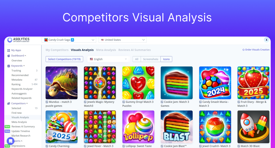
6. Analyze competitors
When designing your iOS app icon, it’s crucial not only to meet Apple’s strict design guidelines but also to understand how competing apps are visually represented. Tools like Asolytics simplify this by providing Competitors Visual Analysis, allowing you to view screenshots and app icons from similar products.
Studying these visuals can reveal valuable insights into successful design patterns, color choices, and branding strategies within your category, helping your icon stand out while fitting seamlessly into the App Store environment.
7. Rebranding app icons
App icons play a crucial role in the initial discovery and onboarding of users, but their importance doesn’t stop there. Regularly updating and rebranding your app icon is essential for maintaining long-term user engagement. Here are several reasons to refresh your app icon periodically:
- Reflect app evolution: As new features are introduced or the core experience changes significantly, your icon should evolve visually to reflect these updates. This ensures users that the app is still in tune with their needs. Take Instagram, for example—though the company frequently updates its logo, it remains consistent with conveying the core experience while showcasing innovation.
- Re-engage existing users: A new icon design can act as a visual prompt, bringing your app back to the attention of familiar users. This subtle reminder encourages them to revisit the app.
- Attract new segments: A refreshed icon, combined with marketing campaigns, can help your app stand out amidst the growing competition, improving discoverability and catching the eye of potential users.
- Combat visual fatigue: Users tend to see the same icons for extended periods, and refreshing the design keeps the experience exciting and prevents it from blending into the background of constant app switching.
- Enhance marketing efforts: Synchronizing your app icon rebrand with new website designs, social media graphics, or seasonal campaigns boosts your overall brand visibility and creates a cohesive marketing experience.
- Stay aligned with market trends: Updating your icon style or messaging ensures that your app continues to resonate with evolving user preferences and market demands over time.
By keeping your app icon fresh and consistent through regular updates, you can ensure that it remains relevant and compelling to both new and existing users, helping to maintain long-term engagement with your app.
A/B Testing Your App Icon Design
You’ve followed the iOS icon guidelines and met all the design requirements, and now you have a few strong app icon options. Great — but don’t rely on intuition to pick the winner. Let data guide your decision through A/B testing.
A/B testing allows you to present different icon designs to separate user groups and see which one performs better in terms of metrics like click-through rate or downloads. For example, you can run a Facebook or Google ad campaign where each user is randomly shown one of the icon variations.
We’ve covered the full details in our article “How to A/B Test Your App Icon”, but here are the key best practices to keep in mind:
- Test one element at a time. To truly understand what’s driving results, isolate variables — like testing a different background color or adjusting the icon’s shape — rather than redesigning everything at once.
- Use a large enough sample size. To ensure reliable results, aim for at least 100 users per variation. The larger your sample, the more accurate your insights will be.
- Randomize user assignment. Randomly assign users to each variation group to reduce bias and get objective results.
- Test across different devices. Icons may look different on various screen sizes and resolutions — ensure your design performs consistently on iPhones, iPads, and other Apple devices.
- Track performance over time. Short-term results are great, but observing behavior trends over a longer period provides a more complete picture.
- Use a trusted A/B testing platform. Rely on proven tools to manage your tests and analyze your data accurately.
- Interpret results in context. Look beyond just the numbers — external factors like seasonality, updates, or marketing campaigns may influence your results.
By testing strategically and interpreting the data with care, you can confidently choose the icon design that will maximize engagement and drive downloads.
Common App Icon Mistakes
Even with a solid understanding of app icon best practices, it’s easy to fall into a few common traps. Here are some missteps to steer clear of:
- Too plain: While simplicity is key, an icon that’s overly generic or lacks personality can fade into the background. Aim for clean design — but also make sure it’s visually compelling enough to catch a user’s attention.
- Too cluttered: Including too much detail, such as photos or lengthy text, can overwhelm a small canvas. Remember, icons appear at tiny sizes — intricate designs or crowded elements will lose clarity and impact.
- Too unclear: If people have to squint or guess what your icon represents, it’s missing the mark. Avoid abstract or overly stylized designs that confuse users. Always test your icon with diverse audiences to ensure it communicates your app’s purpose clearly.
- Too culturally specific: Planning to go global? Ensure your icon design translates well across different cultures. Symbols, colors, or imagery that resonate in one region may carry unintended meanings elsewhere. Take time to research cultural context and test accordingly.
- Not accessible: Don’t overlook accessibility. Use strong contrast and distinguishable colors so your icon remains identifiable for users with visual impairments or cognitive challenges. Clear, accessible visuals make your app more inclusive and approachable for everyone.
By sidestepping these common mistakes, you’ll ensure your app icon not only looks great but also works effectively across audiences and devices.
FAQ
How often should I update my app icon?
You should update your app icon when there are changes to your brand, the app’s interface, or platform design guidelines. Keep an eye on user feedback and update it if it enhances recognition or relevance. However, avoid frequent changes — consistency is crucial for establishing a strong, recognizable brand.
What mistakes should I avoid when designing an app icon?
Common mistakes include using overly intricate designs, adding unnecessary text, and neglecting to check how the icon looks at smaller sizes. Avoid overloading your icon with too many colors, following fleeting trends, or disregarding Apple’s guidelines for safe areas and icon sizes. A clean, timeless, and optimized design is the key to success.
What are the essential design principles for effective app icons?
Your icon should clearly convey your brand identity and remain consistent across different screen sizes and backgrounds. Simplicity and scalability are crucial to ensuring that your icon is clear and impactful in any context.
How can I make my app icon stand out in the App Store?
To make your app icon stand out, create a unique, eye-catching design that clearly reflects the app’s purpose. Use a limited color palette, avoid unnecessary text, and ensure it is easily recognizable even at smaller sizes. Consistency with your app’s overall branding will help build trust and recognition.
Does your app icon need to match your company logo?
Not necessarily. While it’s fine to incorporate elements of your logo, your app icon should primarily represent the app’s function and purpose. Think of it as a product-specific visual — connected to your brand, but focused on the app itself.