According to general statistics on mobile platforms, about half of the people who install the app leave it after the first week of use. The rest will remain active over the next few months. The reasons for leaving might differ, but it mostly happens because the product did not meet the consumers’ expectations. So the number of installs is not the ultimate metric that shows your success; it is important to be able to retain users.
In our experience, user engagement and retention rates are closely related. A competent onboarding in app process will help you increase engagement. Developing a system of guides and hints that makes new users fall in love with your product at first sight and stay with it for a long time can be a real challenge. While simple services can do without it, complex and feature-rich apps should introduce users to existing features more smoothly. In this article, we will discuss the onboarding process and share the best practices.
Table of Contents
What Is Onboarding In App?
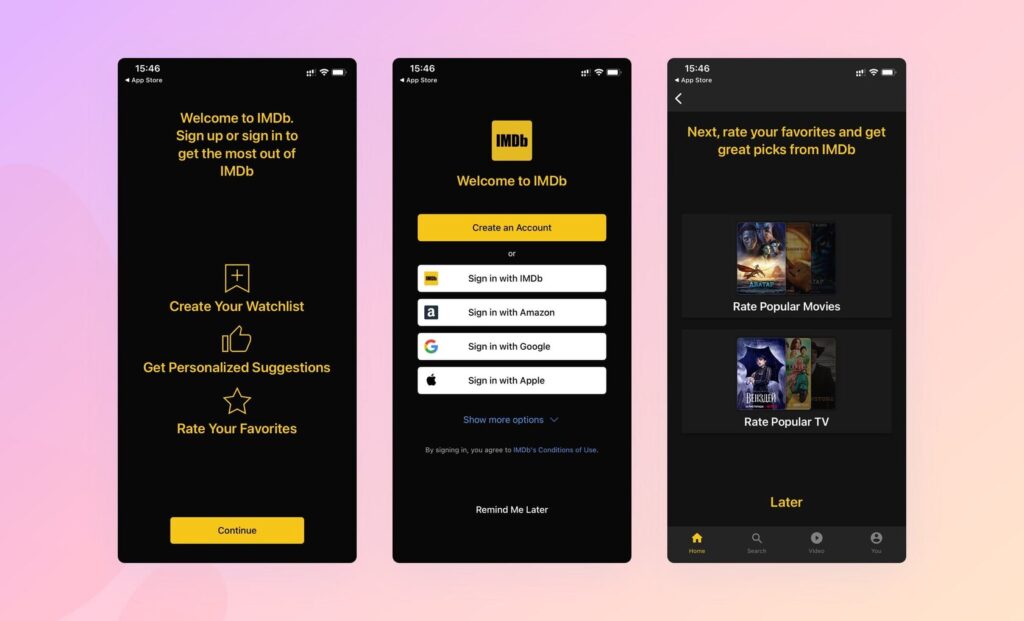
In simple terms, onboarding for apps is a preliminary process of getting to know a product’s capabilities after it is installed. Usually, in this way, developers show the features of work and interaction with the main interface elements, but they also offer the opportunity to pick the necessary settings and consent to data processing after reading the policies. From the first minutes, all this gives users a chance to evaluate the app’s value and usefulness for solving their problems. According to app intelligence, this process (provided that everything is done correctly) helps to increase engagement by four times.
Application onboarding is essential because it helps new users quickly navigate the settings and available tools. This customization saves customers time and makes it easier for the product to “fit” into their daily lives. It is especially important if your app has unique features, you need to obtain user consent for collecting and processing data, or you have updated the product and implemented new tools in it.
Elements of Mobile App Onboarding
While working on onboarding, you can test the best apps to understand how the top players do it. However, it is crucial to remember that each process should be tailored to a specific product. You need to consider the specifics of your project and the target audience’s skills. Among the elements which you can use in your onboarding in app guide are the following:
- Greetings. It is where you can show your creativity. Use funny appeals to users, puns, GIFs, branded tricks, and more.
- Promotion. Next, tell people about the main features and tools. Don’t overwhelm newbies with information and be concise but describe how your app will improve their lives.
- Customization. It is the stage of product personalization when users select the settings that suit them, read the privacy policy, and agree to the data processing.
- Walkthroughs. It is the central part of Android and iOS onboarding in app, where you talk about working with your app. It can be made if the form of:
- tooltips;
- pop-ups;
- carousels;
- banners;
- interstitials;
- guides, etc.

Choose the option with which you can most effectively convey your message.
Walkthrough is the central part of onboarding in app. — Asolytics Team
- Support. It is crucial for multifunctional products. Provide an opportunity to explore your app in depth with the help of reference materials and official guides.
Mobile App Onboarding Best Practices
Quality onboarding can play a significant role in improving or worsening your app conversion rate. Keep these tips in mind as you design your onboarding in app process to ensure your new users stay with you for the long haul.
- Brevity and conciseness
Use short sentences and a simple onboarding in app design. Do not overload readers with information and describe only the main functions. In our experience, guides containing five slides are ideal. However, a lot depends on your app’s characteristics and the audience’s skills. So it requires an individual approach.
- Easy registration
It is inconvenient for many people to enter logins, passwords, and email addresses on portable devices to sign into the system. Make this process as simple as possible: Add the opportunity to sign in with Apple IDs, Google accounts, or social networks.
- Skip button
Always give users the option to skip unnecessary steps or completely abandon the process. Some experienced users can figure everything out on their own. No need to annoy or repel them by forcing them to study mobile onboarding in app screens.
- User progress
It is sometimes tricky to fit key information into five slides. In this case, show the user the number of steps or their progress. It will allow you to set the right expectations and not cause disappointment.
- Consent request
For some services, the request for consent to data processing is an important step in customer interaction. Be sure to ask users to read your policy and give their consent, as well as explain why you need it.
- Possibility to revisit
If users need a refresher or they skipped the application onboarding process by accident, they should be able to go back to it. It might be necessary at any stage of using your product.
- Ongoing onboarding
You can introduce users to the app’s capabilities not only after installation but also in the process of using it. It’s a good idea to tell current customers about new features after you update your product.
Also, the best mobile onboarding examples demonstrate the importance of consistent branding, color scheme, and structure throughout the guide. It creates a smooth visual experience.
Best App Onboarding Examples
You can find popular onboarding in app examples from major companies and brands to understand the most effective techniques and get inspiration. But your approach should depend on your end goal and your audience. The following three methods work most effectively.
App customization
If your service offers a unique experience for each client (for example, workouts in a fitness app), your task is to get the required information using the onboarding in app process. It is how you show that your offer is truly unique and personalized. Explaining why you need this data will help you demonstrate the platform’s capabilities.
App benefits
Use the onboarding in app guide to demonstrate why customers should use your product. That is, you need to describe key features and major benefits to show your value. It will arouse interest in users and confidence in the importance of the app for their tasks.
App usage
It is the obvious but one of the most effective user onboarding in app best practices. The idea of helping customers understand the app and interface is always good. You can not just talk linearly about the main functions but use multi-layered guides, allowing users to study a particular tool if they need it.
Since the purpose of this process is to increase the interest and engagement of users, you need to choose the appropriate type depending on the target audience’s characteristics, like their experience, education, and skills. It will help you make onboarding in app as efficient as possible. What happens next depends on the app content. Read our article “Content for Mobile Apps That Will Engage Your Users” to polish your product.
Application Onboarding for Smooth Immersion and Engagement
Onboarding is an important element of user interaction. When designing it, try to understand how you can improve the user experience, how to be concise and discreet about the main features, and which information should be excluded.
While onboarding in app can actually be useful, you need to be aware that it is not without drawbacks. You will have to spend time and money developing a supporting guide. It also increases the so-called “interaction cost”: Instead of immediately starting to use, a person should make an effort and spend time getting acquainted with the information. Also, in some cases, its effectiveness is not unambiguous. Some experiences show that people use apps equally well if they read the manual or skipped it.
The practices and examples described in the article are great ways to engage customers in the early stages of using your product. However, they do not guarantee success and do not eliminate other possible difficulties with further engagement. In the future, everything depends on the app content and quality, as well as your steps to retain users.


