The first impression is very important in deciding whether to download a product from app stores. Several app page assets work at once to make it as positive as possible, but the game app icon has the greatest impact. Whether a user opens your product page to read the description or not depends on how attractive and catchy it is. It’s because our brains process images faster than texts.
Table of Contents
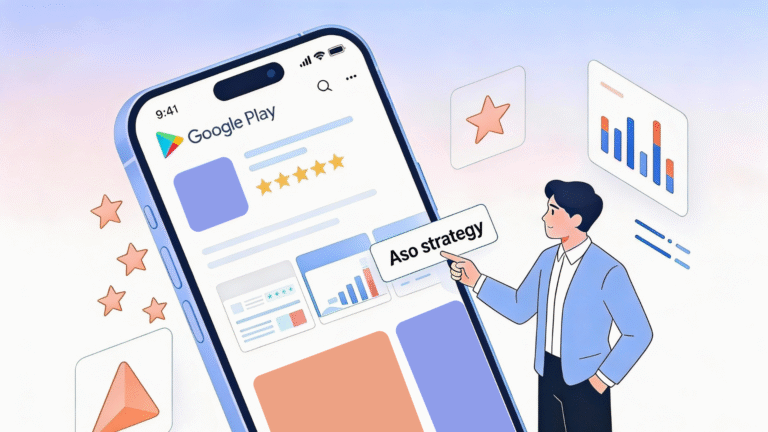
Modern research shows that you should be able to tell potential customers what your product does in 3 seconds. Otherwise, they will lose interest in it. Of course, it is not easy to do, but a fantastic game app icon can make them pay more attention to your app. That’s why you should do quality work when creating this visual asset. You should have several versions to test and choose the option with the highest conversion. Use our app A/B testing guide to arrange the process in the most efficient way.
In this article, we will talk about each platform’s requirements for icons and share our personal experiences in making a striking design. Get ready to create a masterpiece after reading!
What Is a Game App Icon?
When you open a digital store, you get a list of products available for download. Each line has an icon, a title, and a subtitle (App Store) or short description (Play Market). Icons are small pictures that graphically convey the idea of a game or application. According to statistics, it is precisely the detail that users pay attention to first. A high-quality game app icon design should be unique to set you apart from the crowd of similar services. At the same time, you should not get too carried away and forget about the requirements of a particular platform (we will talk about them below).
Most users of Android and iOS devices look for apps and games through branded stores. Since pictures are the first thing that catches your eye, you should know how to make cool game app icon. So your product will not only be more visible in the digital stores themselves but will also attract users’ attention after already being installed on devices. It means clients will run across your product more often and spend more time in your app.
Of course, the functionality is essential for the retention rate and regular launches of your service. However, if the visual assets are bland, a client may not even get to test the internal tools. Along with icons, you need to optimize the accompanying videos and screenshots of your product correctly. You can read more about it in our experts’ article “App Store Tips for App and Mobile Game Icon, Screenshots, and Videos.”
How to Make a Game Icon?
The game app icon placed on the application page in stores is not the same as the logo of your company or brand. The best game app icons “present” the products themselves, not the developers who worked on them. They should not only be bright and stand out among others but also convey the essence of the application. That is why you need to create such elements from scratch thoroughly.
- Preliminary analysis
Market valuation should be at the heart of everything you do. Carefully study how your competitors present their products, show their strengths, and hide their weaknesses. Take a deeper look and determine why a particular game app icon is getting more clicks than another. You also need to understand what concepts and styles are generally accepted in your category. They are large-scale precisely because they are in demand by consumers. It’s essential to keep the balance between the general trend and your uniqueness. - Required software
You can draw the picture yourself using the software to create icons or ask professional illustrators for help. Experienced users sketch game app icons in Photoshop. It provides the widest range of tools needed for such an activity. However, it can be quite challenging to master. If you’re looking for an easier option (especially if you want to get a minimalist image), opt for online services with ready-made templates and logos like Placeit. Or just use a more user-friendly image editor like Inkscape. - Platforms’ requirements
The creativity of developers is driven by the framework of the app stores’ requirements. For your application to pass moderation, you need to follow them.
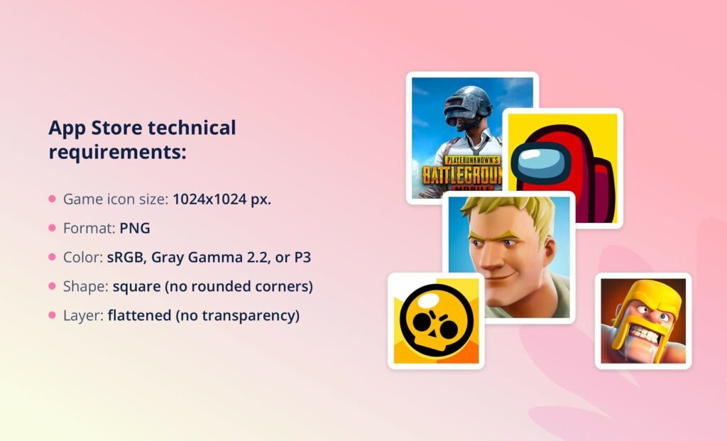
App Store technical requirements
- Game icon size: 1024×1024 pt.
- Format: PNG.
- Color: sRGB, Gray Gamma 2.2, or P3.
- Shape: square (no rounded corners).
- Layer: flattened (no transparency).
In addition to specifications, there are also general guidelines. For example, you should not use texts that are not a company logo and words that force users to install the product. Photos or screenshots of your app or Apple products shouldn’t be used as well. Also, avoid depicting guns, bombs, and other weapons in your pictures.
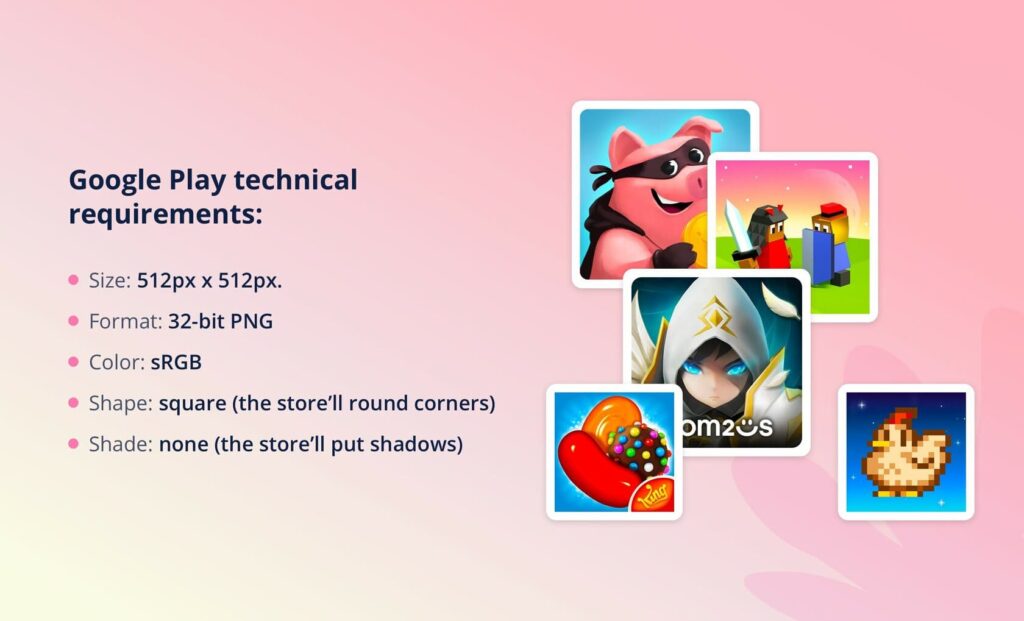
Google Play technical requirements
- Size: 512px x 512px.
- Format: 32-bit PNG.
- Color: sRGB.
- Shape: square (the store’ll round corners).
- Shade: none (the store’ll put shadows).
Play Market recommends that you are guided by your style when generating pictures. So, for example, game app icons vector look better if they are located according to the keylines and do not occupy full asset space. Hand-drawn illustrations, on the contrary, look more attractive if they take up the full area. Do not use false graphic elements, badges, inscriptions, and calls to action that may mislead the audience.
- Testing
Create several great icon variations and do A/B testing to see which works best. This way, you can choose the version that gives you the most installs. Keep in mind that App Store and Google Play audiences are different. If your image has received positive reactions in one store, it may not be as effective in another. It’s common to have different icons on different platforms.
- After-launch work
Like other app page assets, work on game app icons continues even after launch. You need to keep an eye on their performance and conversion rate to keep your product on the top-rank mobile games and apps list. Over time, trends may change, which means you need to adjust the look of your page in app stores. Besides, it’s helpful for gaining attention to revise the picture depending on the seasons and holidays.
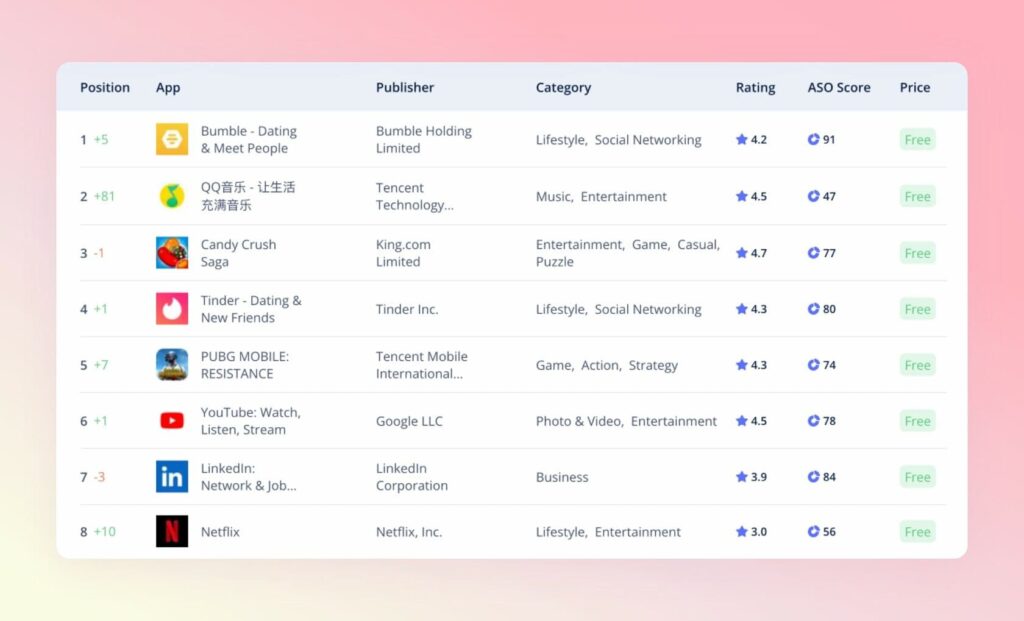
App Rating by Asolytics Analytic Tools
Best Practices for Design Game Icons
From our own experience, we have deduced several principles of how to design a game app that really attracts users’ attention. Here are the main points.
Visual language
Pick the key items or features that characterize your application and draw them. You can use the keywords you collected for text optimization, translate them into a visual language, and use them when creating a gaming app logo. Ask your friends, family, and colleagues what they associate your product with. For this task, brainstorming is a great option.
Authenticity and uniqueness
Do not copy other brands’ logos. Even if they are successful, simple duplicates will work for you. Now users carefully avoid copies and fakes, so this way, you alienate your target audience. Moreover, a poorly designed game app icon can mislead users about the true essence of the product. Even if they download it, they will delete it right after the first use. It is definitely not what you want to achieve.
Scalability
Your picture should look great on all models and devices. And not only in app stores but also on the displays of smartphones and tablets, in pop-up notifications, task managers, and so on. Since a game app icon can be either smaller or larger, what is displayed on it should look good at any size. For example, if you want to put the main character on it, think about whether the details in the small picture will be distinguishable. Perhaps you should leave only the head or take another idea.
Minimalism
Minimalism is one of the icons best practices because images with a small amount of detail look good on all gadgets but are also easy to remember, which is important for expanding the number of customers. A simple design helps you convey a clear and understandable message about what your product is all about. Users don’t want to waste their time looking at a logo and puzzling over its meaning. They will just skip your application. That is why conciseness and simplicity are the keys to success.
Information value
Your product, in terms of functionality, can have many uses. However, it still has a clear focus and solves specific user problems. Put the main aspect and display it. Game app icons not showing the essence of the product will simply be incomprehensible to customers. Also, always opt for images over texts, as our brains process them faster.
Final Thoughts on Designing App Store Icon
A cool and eye-catching icon is a real game-changer. It’s one of the first page assets that users notice and may tempt them to download your product or keep scrolling. You can tell about yourself even before a visitor opens the application page with it. The icon performs the following tasks:
- presents the essence of your application;
- makes the product stand out from your competitors;
- attracts users’ attention;
- increases the conversion rate;
- used by digital stores in other places (not only in search results);
- affects engagement rates after installation.
As you can see, such a tiny item has a huge impact on your product’s success. Therefore, its creation should be given much attention as part of the effective ASO strategy development. Follow our recommendations and general requirements of digital stores to sketch a unique icon that fully matches your style and reflects the app’s essence. Together with Asolytics, you will achieve success and be able to bring your product to the top of the best!