
Did you know that your mobile app icon, along with other vital creatives, can noticeably boost your mobile app downloads? That’s a proven fact! The tiny thing takes up just a few hundred pixels but is powerful enough to make your potential app users decide whether they want to install (and invest in) your product or not.
To maximize its impact, you need to know how to A/B test icon your app and find the version that drives the most engagement. An app icon can be your reliable ally in winning over new users and turning them into paying customers — if you get it right!
Table of Contents
What Makes a Great App Icon?
A good app icon does more than just grab the viewer’s attention – it tells them a fascinating visual story about your brand and your company values. It efficiently informs the user about what is inside the app and, at the same time, appeals to their emotional side, building connections and sparking curiosity. An app icon that lacks the ability to communicate or engage cannot be considered successful.
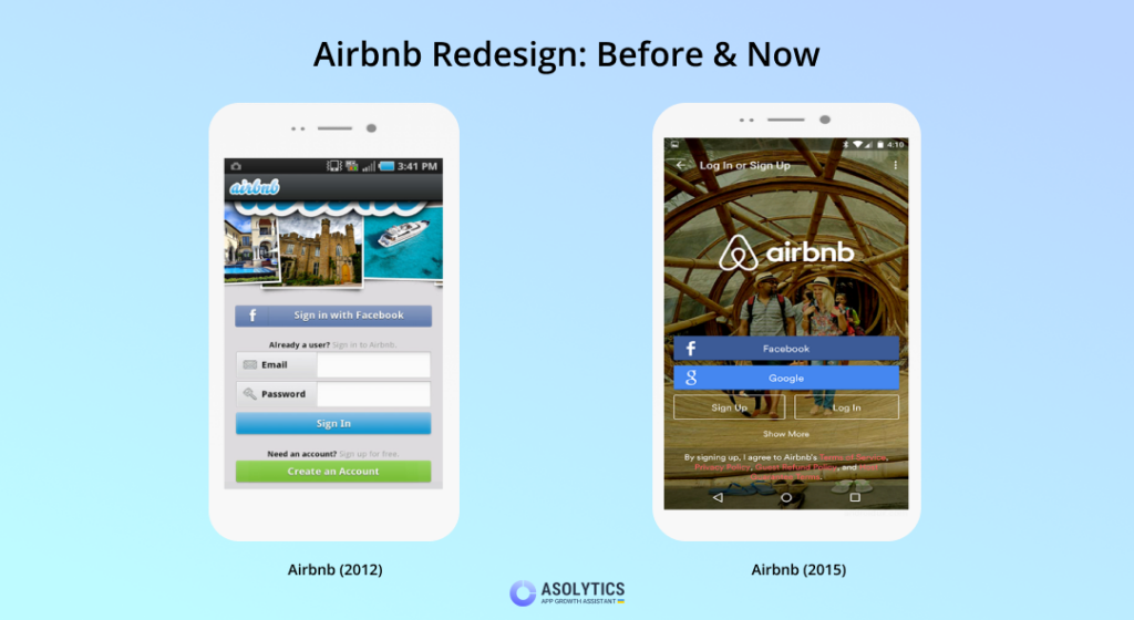
In fact, research shows that a visually stimulating icon can increase app downloads by a whopping 560%. For example, when Airbnb had its app icon redone into something as simple as a capital “A” that reminds of an inverted heart, it immediately led to a surge in downloads. People just related to an image they found appealing and meaningful. Why can’t the same happen to your product?
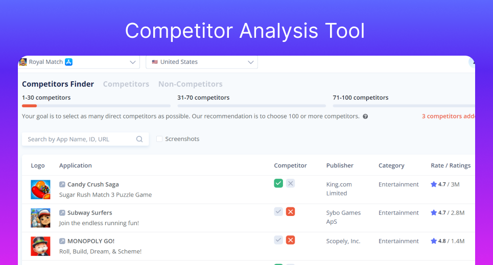
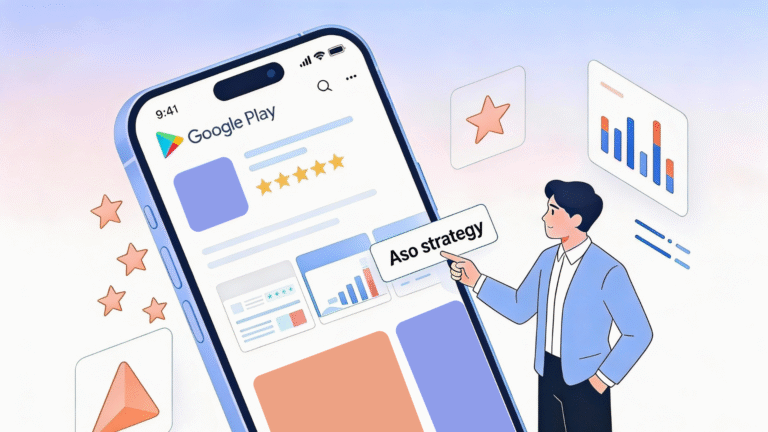
You can check your competitors’ apps icons in a Find new competitors analysis tool
How Do You Create a Fantastic Icon for Your App?
We have been through this before and have covered the best app icon-making tips extensively in our other posts, but just in case you need a quick refresher, here is how you create a well-designed, eye-catching app icon that will communicate your app’s value clearly and attract attention on the spot:
- Versatility is important: since your icon is going to show up on different screens and devices, you need to make sure it looks equally good and maintains its original quality of design in various sizes and contexts. It has to remain easily recognizable even when the user views it on a smaller screen.
- It is all about simplicity and clarity: in a busy app store, your icon needs to grab attention and show what your application does – all in one go. Keep it simple and avoid using just your logo, at least until your brand is better known by users. Your icon should represent your app’s main idea and exploit colors that match its overall design.
- Your icon has to stand out: the more distinctive your icon design is, the easier it is to spot. Pick a unique shape or object, and do not be shy to use bold, vibrant colors.
- Forget about text: texts are sometimes challenging to read, even on larger screens. On a smartphone with its limited screen real estate, using text in your icon will simply be a waste of opportunity to promote your brand.
- Use borders or frame it: this little app icon design trick has been successfully used by some of the biggest and most powerful apps, including Snapchat, Instagram, and others. This technique can make specific icon design elements more prominent and easily recognizable.
- Choose colors that will preserve the ‘pop’ effect of your icon no matter the background: test your app icon against various backgrounds to make sure it looks good when placed upon lighter or darker wallpapers. The last thing any app maker wants is to have their product deleted because it clashes with the overall aesthetics of a user’s device.
There are more tips and tricks to try, but the above six are usually enough to help you create an icon that will catch the user’s eye, represent your app effectively, and leave a lasting impression.
Before you A/B Test icon your app in accordance with our guide below, make sure you have up to 5 attention-grabbing app icon designs to choose from. In the long run, you’ll only have to stick with one. But if you make the right choice, it is sure to take your mobile app profit to the next level.
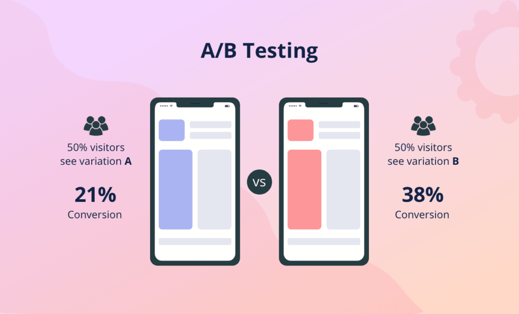
Wondering how to customize app icons and transform your viewers to paying users? Neither your colleagues nor family members will effectively help you get it right. That’s where laser-focused A/B testing (also referred to as split testing) comes into play.
Why Does A/B Testing Icons Matter?
Creating an effective icon is no simple task, and very few companies get it right on their first try. But those who do almost universally say that they performed an A/B test icon your app to fine-tune their original design and maximize the impact.
Here are five compelling reasons why a b testing mobile app icons is a must:
- Gives you valuable feedback to choose the perfect icon
A/B testing helps you choose the best-performing icon by comparing different designs and providing valuable insights into how users behave when interacting with it. - Allows you to enhance UX
With detail-oriented A/B testing, you can discover which icon resonates best with users, improving their overall experience with the product and giving them precisely what they want. - Saves you time and money
A/B testing enables you to spot design problems early and save time and money on expensive fixes further down the road. Instead of costly corrections, you’ll have immediate improvements. It is a win-win for both you and your potential users. - Boosts conversions, downloads, and revenue
It is simple: equipped with a good mobile app and a b testing strategy that involves an A/B test icon your app, you will be able to optimize your app logo for higher conversion rates, which should lead to more downloads and increased profits.
- Gives you an edge over the competition
A/B testing can keep you well ahead of the game if you choose to make it a permanent part of your ongoing optimization strategy. It means you must regularly go back to your app icon design to see how it is doing and make necessary improvements.
Now that you know the benefits that come with conducting thorough a/b testing for mobile app in general and its icon component in particular, let us talk about the challenges you may encounter during this process. While there aren’t many, it is essential to be aware of them as it will allow you to navigate them more effectively.
- Resources: you need to be willing to invest your time, effort, and finances into creating a testing framework, gathering the right tools, and possibly employing expert assistance.
- Sample size: depending on the size of your app and the popularity of the category it falls into, finding a large enough sample size to get reliable results might be difficult.
- Participation encouragement: getting users to engage in testing can be tricky without proper motivation.
- Duration: you need to be very careful when determining the optimal duration of your test: if you make it too short, the results might not be sufficiently accurate, but a too-long testing process delays improvements.
- Correct interpretation: the hardest part yet is analyzing the results you got correctly and drawing accurate conclusions. If you lack the expertise to do it yourself, it is best to find a specialist to avoid misjudgment and missed opportunities.
Despite these challenges, the A/B test icon offers more benefits than drawbacks. But, can mobile app go through a/b testing at a minimal cost for the developer? Absolutely! With the right tools and a good strategy, you can improve your app icon for greater app store performance while keeping the associated costs manageable.
In this post, we’ll cover the basics of mobile app A/B testing and provide detailed recommendations on the process. So, if you’re interested in learning how to effectively implement the best A/B testing app practices within your Android- or iOS-focused target audience, you’ve come to the right place. Keep reading and let this guide lead your way to success.
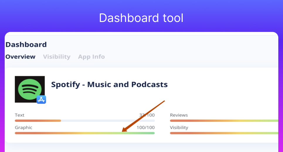
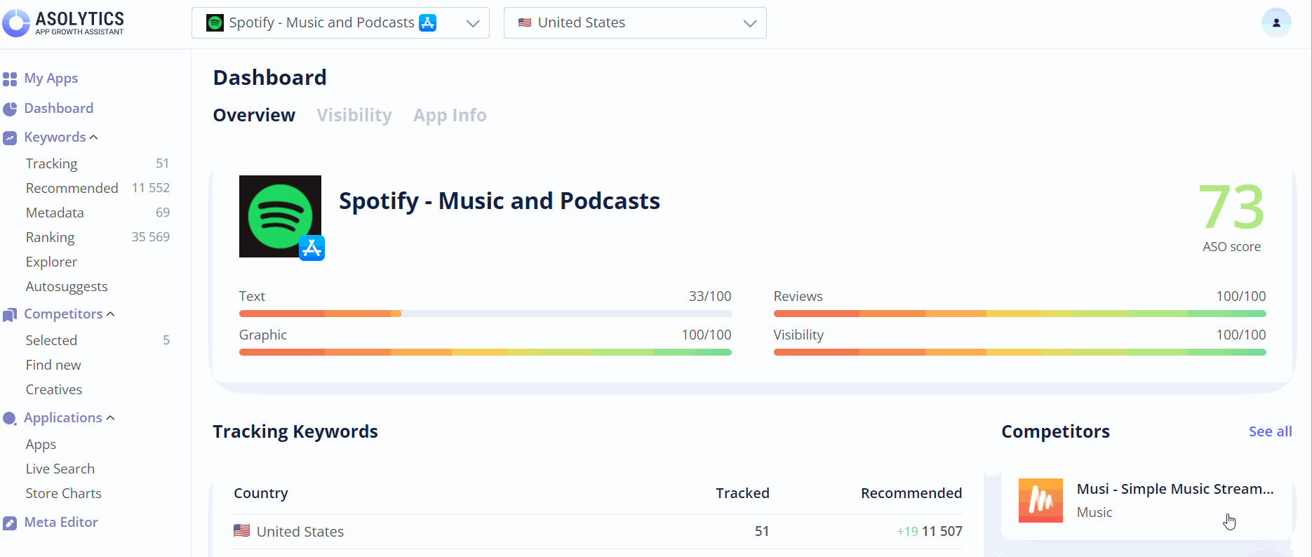
Check how good your app’s icon works at Dashboard in Asolytics tools
A/B Test App Icon With Google Play’s New Tool
The dev team behind Android has made split testing easy. Just make the most of the new Experiment option in your console and run a variety of attributes through their paces, including your mobile app icon. Focus on doing a Global experiment. You can try more intricate (regionally adjusted) tests later, but at this point, prioritize rolling out your app with the best icon. This will definitely elevate your mobile app statistics to the next level.
Here’s a quick step-by-step guide for running split testing via Google Play’s tool:
- Indicate the name of your experiment. Go for a descriptive name that will help you easily distinguish between different tests you’ll run. This name is for your reference only, so make it clear and informative, and include relevant keywords, e.g., App icon_FR-fr, where “App icon” shows the object of testing and the “FR-fr” part refers to the country you are testing it for and the language used.
- Choose your audience mix. You can choose what percentage of store visitors will see your experimental variant instead of your current app icon. If you have multiple versions (like A, B, C), the audience will be equally divided among them for fair testing outcomes.
- Select ’Hi-res icon’ in the corresponding ‘Attributes’ section. This will allow your target audience to see your tested variants as 512*512 32-bit PNG files, ensuring they get a clear and detailed view of the differences between versions.
- Upload your icon versions, making sure they’re within the required sizes. Top-notch quality and precision are of crucial importance here, as pixelated or blurry icons will not let you gather accurate results from your A/B test icon.
- Ensure that all the uploaded icon versions are in perfect shape graphics-wise. Icons should be visually appealing and convey your app’s purpose and your company’s branding clearly. That’s about it. You’re ready for the performance-test icon experiment.
Incorporate variants for each icon you created. People in various test groups will be shown different icons, but one single version is saved throughout the experiment period to prevent users from seeing the alternative versions in case of revisiting your product page. Once you collect enough information, the best-performing icon should surface.
Here are a few additional pointers to help make your A/B app icon test with Google Play’s tool an even bigger success. These come in the form of no-nos – things you should steer clear of:
- Testing for less than 7 days: looking at just one day’s results can make people very happy with how their app icon is performing; however, it’s the overall performance that truly matters. Test your variants for a full week, not just one day, to get a more reliable picture of how they are performing and make informed decisions.
- Being misled by day-of-the-week effects: it is common for users to behave in a specific way on certain days of the week (e.g., increased searches, spikes in downloads, etc.) Running the test for a long enough time will help developers exclude any potentially confusing effects from the results.
- Testing all variants together: when testing multiple variants at the same time, Google users will not be able to see which of the variants receives the traffic, just the total number of downloads. Although testing these separately might require more time and effort, it is a more reliable way to understand how each variant performs.
A/B testing your app icon should not be limited to Android; it is an equally effective technique for products advertised on the iOS platform and other app stores. If performed correctly, it makes your icon work better, resulting in more people noticing your product, downloading your app, and getting more engaged with it. Want to know how to split-test your app icon for iOS? With a little ’elbow grease’ and a think-out-of-the-box approach, you can easily cope with this task, too. We’ll let you in on the process in the next section, so keep reading.
iOS-Focused A/B Testing App Tips
If you’re looking to A/B test your app within iOS and other app stores, make use of paid split testing on Facebook. As a matter of fact, Facebook is very effective when it comes to testing app icons. With its extensive user catalog, advanced targeting possibilities, as well as the reputation of the leading service on both web and mobile, Facebook is perfect for split testing.
Below, we’ve listed some useful tips on A/B testing your iOS app via Facebook. These are the recommendations every A/B test icon developer should keep in mind when utilizing Facebook capabilities to optimize their icon for better app store performance:
- Set the campaign to Cost Per Impression. That way, you will invest a certain amount of money in a fixed number of impressions. If you opt for Cost Per Click, this will show most frequently clicked ads to your potential users.
- Simplicity is key. When running a campaign, you should concentrate on test-driving a variety of app icon ideas with banner ads. Make your banner ads simple in terms of context while keeping your entire focus on the icon. Play with your icon designs in order to figure out which option is best during ASO ab testing. Stay with the version that generates the most clicks with your target audience. Whether you’re deciding on the very first icon for your app or want to upgrade the old one, this strategy is very effective.
- Diversify your targeting approach. In order to do that, target several groups of users that may fancy your product. Use such parameters as age, gender, location, field of work, and the like in order to perform segmented targeting. As a result, you will pick the right icon for the right target consumer group. Targeting people who are genuinely interested in what you can offer them cannot but result in more downloads and conversions.
- Don’t forget to pause the campaign when you’re through. When it’s time to compare the number of impressions across each icon version you’ve test-driven, make sure you manually pause the campaign. Because if you don’t, it will run until your budget runs out, and the results will be far from trustworthy.
Some More App A/B Testing Hacks
Can’t get enough of our expert recommendations on potentially successful A/B test icons for your app? Want more tips from professionals with years of experience in the field? We’ve got you covered. Here are some more handy hacks for you to make use of.
- Be bold and precise when split testing your app icon
Need some forthright answers? Use icon concepts that are bravely versatile. Your new icon versions should differ from the original in a very significant way. After A/B-test-determining which icon version performs best, experiment with its subtle adjustments right until you pinpoint the absolute champion among them.
As a matter of fact, your upgraded (or brand new) icon design can easily attract potential users who used to disregard the older version. By updating the icon after effectively performing split testing, you can make your potential users think it’s a brand-new product. With that said, the power of your app icon should never be underestimated. - Laser-like focus is key when it comes to A/B testing your app icon
What we mean here is that if you’re aiming for maximum efficiency and accuracy, you should concentrate on one element per split testing campaign only. Don’t be tempted to change your other creatives or metadata items, too, for this is a counterproductive approach.
While focusing on that one element, make sure to test it exhaustively. If it is an icon you are testing, try many different designs, colors, and styles. Do not stop at just one or two variations; explore a wide range of possibilities. Being thorough can help reveal unexpected insights and assist with informed decision-making for enhanced app icon performance. - Think outside installs
Bear in mind that the ultimate goal of your app icon split testing endeavors should be attracting the right kind of audience. With that said, for instance, if you created your app to attract paying users and so far, it only brings downloads, your app icon targets the wrong audience. On that basis, refine your creatives with your ultimate goal in mind; don’t just aim at boosting downloads. - Research each testing environment robustly
You should keep in mind that if you use Google Experiments for A/B testing of your app icon, the tool may not provide you with some profound tracking tools for achieving the best tracking results. Facebook-based split testing possibilities are, on the contrary, equipped with a truly in-depth level of tracking. Long story short, make sure you do your homework in regard to each of these two routes prior to sticking with one of them long-term.
Here is a quick pros/cons list for both options:
Google Experiments
Pros:
- Integration with Google Play Store for Android apps.
- Simplicity and ease of use.
Cons:
- Limited tracking and insights compared to Facebook, which brings challenges in identifying the true impact of test elements.
Facebook-Based Split Testing
Pros:
- Robust tracking and detailed insights.
- Extensive user targeting options.
Cons:
- Sometimes, it requires more expertise to set up and manage effectively.
By carefully considering your testing goals and matching them against the capabilities of each of the two platforms, you can make informed decisions and find the shortest route to optimizing your app icon performance effectively.
- App icon split testing works wonders
After performing an A/B test icon on our clients’ app icon variations, the best one generated nearly 20% more hits. Yes, that’s up to 20% more potential downloads (and possibly even paying clients). The results are truly impressive, wouldn’t you agree?
Based on these vital observations, you can draw one very important conclusion: adjusting your game app icon design and performing app icon test to identify the best-performing icon version is something that’s worth investing your resources in. In the long run, this smart approach will take your entire business to a whole new level.
Conclusion: A/B Test Your App Icon Like a Pro
Cutting to the chase, do not rely on your taste and instincts only when it comes to choosing the icon for your application. Make the most of the a b testing icon process based on the afore-described methods, and you will stay with the icon your mobile audience targeting adores.
But remember, an A/B test icon isn’t a one-time job that you can successfully complete and forget about. Making it an ongoing effort is important for maintaining your app’s appeal and relevance to the user. The mobile app world changes constantly, with new trends and competitors appearing regularly. To keep on top of that, you have to:
- Stay agile: it means being always ready for change, as well as testing and refining your app icon regularly to keep up with the shifts in user preferences.
- Monitor your competition: it is important to keep a close eye on the rival apps to understand the strategies they are using, as well as their successes and failures. This knowledge can be of massive help to you in your A/B testing efforts.
- Collect user feedback: keep your communication channels open to listen to your users’ feedback about the app and its individual elements. This information can provide valuable insights into what is working and what needs fixing.
- Follow industry trends: stay updated on the trends and new practices that appear. These will show you which changes you might need to incorporate to stay competitive.
- Think beyond icon optimization: your app icon is just the beginning. You will need to test other crucial elements, descriptions, screenshots, and pricing to make sure that each one strikes the perfect balance between your users’ preferences and your goals.
So, to keep your app thriving, you will need to embrace an iterative approach to A/B testing. By regularly revisiting your icon and other core elements and improving them to meet evolving user expectations, you can guarantee that your app stays fresh and captivating.
FAQ
Let us wrap things up with some quick questions and answers.
What is an A/B test icon?
It is a trusted assessment technique that involves comparing two or more versions of something to determine which one does better under similar conditions. For example, icon a/b testing can help refine your app’s appearance for better app store performance.
Why a/b test?
A/B testing helps optimize elements like icons, UI, and more to improve user engagement and achieve better product performance overall. For example, a/b testing icon can help increase the app’s downloads and conversions, leading to financial gains for the developer.
What are some AB testing examples?
Some common A/B test icon examples include comparing different website headlines, testing subject lines to see which one attracts higher email open rates, and experimenting with app icons to find the one that will lead to better engagement and more conversions.
A/B testing is a powerful tool for improving your product’s app store performance. If you have more questions or need personalized advice, do not hesitate to reach out to the Asolytics team directly.
Key Takeaways
So, what does it all come down to? Here’s a brief summary of this article’s key points:
- A wisely chosen icon design can bolster your app downloads tremendously. Your icon is the first impression users get of your app, and a meticulously crafted and optimized one can significantly increase click-through rates and overall user engagement.
- Choosing the right icon based on zero reasoning (or a friend’s advice) is futile. Making icon-optimization decisions based on your gut feelings or close friends’ suggestions instead of using data-driven insights provided by A/B testing can lead to poor outcomes.
- With a truly effective split testing strategy at your fingertips, you can succeed in determining the highest-performing icon that resonates most with your target audience and drives better performance.
- Be bold and flexible when A/B test icon. Do not be afraid to experiment with multiple and diverse design elements, colors, and styles. Bold changes can bring about surprising improvements and impressive results.
- Concentrate on split testing your icon only, the rest app page elements and creatives should be A/B tested separately. Isolating your icon testing allows you to achieve more accurate, focused results and gain better insights into how it impacts user behavior.
- The results of split testing should stimulate the right audience to take the right action towards your application, meaning, if you want your potential users to download it and become paying clients, your app icon optimization efforts should be expressly focused on that mission.
- Don’t miss a single blog post on how to test your app from our experts — add us to your favorite bookmarks and get back for more updates on app optimization.
Do you have anything to add or ask on the topic? Your insights, questions, opinions, and experiences are hugely important. Leave a comment below to get the discussion going. We value your feedback greatly.
And if you are eager to take your app optimization to the next level, don’t hesitate to give our ASO platform a go. The Asolytics platform is specifically designed to empower app creators, offering them the right tools and resources to promote their product’s visibility, performance, and overall success. Chances are it will help you skyrocket your app to stardom as well!