
Mobile applications are a must-have for many modern businesses as they assure an all-time and convenient contact with the consumer. However, it is not enough to develop a good product – you also need to drive App Store users to it and get them interested in installing. An efficient and well-planned ASO strategy will allow you to optimize your mobile app or game properly. With its help, you will be able to present essential text-based and visual elements like a mobile game icon, screenshots, and preview video in just the right way to get the user hooked up on the spot.
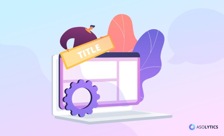
Our knowledgeable Asolytics team continues to update you on what is buzzing in the ASO world right now and introduce the latest insights about how to make the best use of your text elements and creative assets within an app store. This simple manual intends to teach you about optimizing your product page visuals for App Store, making your app or game more visible and downloadable. To learn how to optimize visuals for Google Play, read our guide Google Play Visuals Optimization: Icon, Screenshots, and Videos.
Keep reading to find out the answers to the following questions:
- Why does proper visual presentation in the App Store matter?
- What makes the App Store Optimization process so essential?
- How to design a product page so that your app is viewed, downloaded, used, and rated highly?
Table of Contents
Why ASO Matters a Great Deal?
Statistically, it takes a semantically and visually optimized product page less than 3 seconds to catch the user’s attention and encourage further exploration. It is these few seconds that often impact the decision to install. At that, the competition among App Store products with similar characteristics has never been more intense, and you will need to do a stellar research and analytics job and tap deep into your creative resources to make your product stand out from the crowd.
For your app store product page to increase conversions and be able to compete with top iPhone apps, it needs to be visible, easily discoverable, and attractive. That is a lot to be expected of a single page, yet it is how app store marketing works, and we have to abide. Luckily, Asolytics experts are here to walk you through all the aspects of the visual optimization process for App Store product pages. We will talk about the different graphic elements of the app page, explain which ASO techniques help drive most installs and provide recommendations in the graphics requirements department. Buckle up, and let us get the fun going!
Key ASO terminology:
- ASO (App Store Optimization) is a set of measures to improve the search discoverability of apps and games in mobile stores. ASO makes the app more visible to users, boosts downloads, and — most importantly — increases the product’s app store conversion rates. We have prepared for you a detailed article on what is ASO, after reading which you will be able to qualitatively optimize your applications.
- Creative assets are a collective of graphic elements — a game app icon, screenshots, and an app video preview — used to visually present your mobile product to the app store user and encourage them to install the application.
As mentioned above, the three most crucial aspects you should focus your visual ASO optimization efforts on are icons, screenshots, and videos. Let us now look at what they are, which requirements different app stores impose on these graphics, and how they affect conversion.
App Icon
An icon is the first graphic element of the product page design that users interact with; for that reason, it plays a central role in creating a favorable initial impression. The icon must be vivid and memorable to set your product apart from the rest of the competition. Visually enhancing it will give you the best chance of gripping the user’s attention on the fly.
Genuinely cool game icons are not just attractive and unique — they also aid the user in understanding the purpose and value of your app or game without the need to open the full description and read about these. When working on an app icon, make sure to keep these suggestions in mind:
- Lay focus on a single object
Keeping it simple and engaging is key. Help your user understand what your product offers by focusing their attention on just one function, a distinct advantage of the app, or a single main game character.
- Do not insert text
Since icon size for app store is fairly limited, reading whatever text you put on them might be a problem for the user. Besides, plastering the app name on the icon makes it look needlessly crammed and poses significant challenges for further localization.
- Utilize vivid and contrasting colors and shades
Make your app icon’s central object contrast with the background to help it pop. Pick a dark backdrop for a light- or medium-colored object and vice versa. Remember that a transparent background robs you of whatever little creative asset space you have.
- Make your app icon easy to recognize
A game or app icon that has users guessing what they are looking at is no good. Do your creative best to design an icon that can be linked to your brand or game without much effort.
Below are some tips and requirements for creating great app game icons for the Apple App Store.
Tips for Apple App Store: when you are following the iOS icon guidelines, the aim is to develop an appealing aesthetic consistent with your brand identity, main game features, or the primary functions of the app.
- Size: 512*512 pixels/1024*1024 pixels.
- Format: PNG, JPG.
- Shape: Square, no rounded corners.
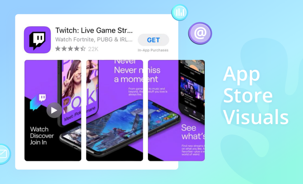
App Screenshots
Screenshots that take up to 75% of the listing visuals of your app store product page are among the most valuable visual assets in the developer arsenal. They play an essential role in helping users decide whether the game or app is worth downloading. Thus, carefully analyzing and tweaking your app store screenshots can have a massive influence on the app conversion rate of your app product page. Here are some tips to be guided by when producing mobile game screenshots:
- Convey the central idea of your app or game in the first screenshot
Your screenshots must be relevant and truthful and display the best app feature or the most impactful game scene. Ideally, users have to be able to tell what the app does and what value it offers just by looking at the first AppStore screenshot.
- Make screenshots into a compelling story
Connecting your screenshots with a single, gripping storyline is a more efficient technique than using a series of stand-alone pictures. You can experiment with the basis for such storytelling – for example, try splitting images that convey the same message or consider using the same background design for all your screenshots.
- Keep the captions brief, on-point, and readable
Any text you choose to include in your screenshots should be visible, concise, and appropriate. Small fonts and sentences that are too long might kill the app-user bonding moment at the very start.
- Localize your graphics to build a better rapport with your international audience
Translate the text of your screenshots, plus do some research on your target audience to make sure your screenshots are appropriate for other cultures and traditions.
Please read about some more store-specific guidelines and requirements for generating incredible app and game screenshots below.
Tips for Apple App Store: in portrait mode, the app store shows three screenshots in the search results, while only the first horizontal screenshot will appear in the search results when landscape mode is selected. If you plan to use a landscape screenshot for your mobile game, make sure it captures the most prominent trait of your product.
- Size: 1-10 screenshots of sizes 6.5” (iPhone XS Max/XR), 5.5” (iPhone 6, 7, 8 Plus), and 12.9” (iPad Pro 2 and 3). For other device models in need of a different app screenshot size, screenshots will be downsized by the platform automatically.
- Format: PNG or JPEG portrait or landscape images.
App Preview/Promotional Videos
When looking for a new app to install, some users thumb through the screenshots, while others opt to study the available video in depth. An engaging short video demonstrating how your product works and how it is different from others can offer the user a more immersive and interactive experience. App Store preview videos are particularly useful for mobile game developers. With their help, users can better understand crucial aspects of the product, see if it is within their preferred genre, assess its entertainment potential, get somewhat familiar with its mechanics, etc.
Here is something to keep in mind when working on an app preview for App Store:
- Let your video build a coherent and meaningful story
Offer your users a picture of the journey they will take if they install your product. Show your users which milestone achievements they should expect along the way and what the final goal of the journey is.
- Keep it engagingly simple for your users
Using your video to communicate a simple, well-cut, and helpful message to your viewers is always preferable to packing it with elaborate and overwhelming visuals. Your goal is to make a digestible video product that addresses two simple questions: What does the app do? Why do I need to install it?
- Focus on showing the advantages, not listing the features
Spell out the main benefits of your product for the user instead of simply naming its key features and letting them guess.
- Do not refer to specific events or hot topics
Do not mention any timewise recognizable events in your video to avoid having to re-make it once the business of the day has changed.
Tips for Apple App Store: in the Apple App Store, developers can post short videos of up to 30 seconds long, giving a detailed overview of what users will experience if they download the app or game. iOS app previews can target only one region, which is why it is best to create an engaging animated video without any text to reach out to a broader audience.
- Length: 15-30 seconds.
- Resolutions: landscape or portrait, device-specific – regular iPhones (1080*1920 or 1920*1080), iPhone X (886*1920 or 1920*886), iPad (1200*1600 or 1600*1200).
- Extensions: mov, m4v, mp4.
For more details on how to create app store assets for iOS apps and games, check with the Apple App Store official website.
Most Common Mistakes to Avoid When Optimizing Your App Store Visuals
Here are some of the most common mistakes to avoid in your visual app store optimization strategy:
- Not localizing your creative visuals for multiple markets and audiences. By not utilizing localization into different languages, you deprive yourself of access to a significant portion of your audience.
- Failing to make regular changes. ASO is not a one-time activity but systematic and continuous work on improving the application visibility and downloadability of your product within an app store. To make your promotion efforts a success, you have to monitor the latest trends, enhancing your app accordingly.
- Introducing too many changes at once. This way, you will never understand which of the actions taken have been unsuccessful and which have helped improve your target KPIs. It is best to introduce one change at a time and make a comprehensive assessment of its performance before moving on to the next activity.
- Building your decisions upon incorrect data. Double-check your input optimization data and use multiple data sources to get a realistic and weighted estimate you will base your marketing campaigns upon.
- Ignoring A/B tests. Testing your creative assets is critical to identifying what works best to drive conversions. To use an external solution efficiently, learn How to A/B Test Icon Your App.
In Conclusion
- The App Store product pages are your brand’s chance to boast its uniqueness, creativity, and usefulness, as well as attract the attention of new users, convincing them to download your mobile game or app. If the specific store regulations do not limit your ability to be creative when designing your product page, build an unusual and engaging customer journey for your users.
- Your creative visuals must ultimately serve one goal – communicate how your mobile product will change and improve the lives of its users. You might be proud of having perfected your interface and implemented some fancy features but, for the end-user, it is the entireness of the experience that matters the most, so focus on that.
- Some of those involved in App Store product page optimization underestimate the importance of improving the visual side of things. Instead, they often prefer to concentrate their best efforts solely on keywords, which leads to their ASO strategy failing to achieve its purpose. Make no mistake: in mobile app marketing, looks are just as crucial. Using the recommendations provided by the Asolytics team, you are guaranteed to make your next ASO campaign a blast!