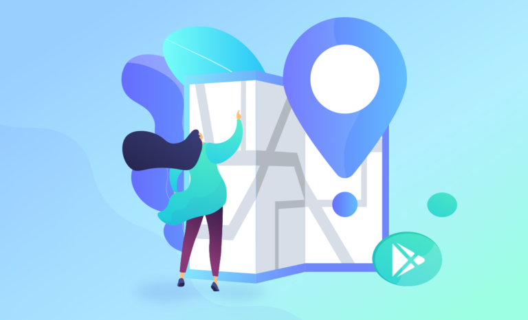
With over 2.56M Android games and apps in the Google Play Store, making your product visible to users is a challenging task, but it is a must-do if you want to give your application a chance to thrive. What developers need to understand is that not every Google Play user is a keen reader, so, as much as it helps discoverability, working on your keywords alone is not going to do the trick. You also have to invest in perfecting your creative assets such as the game app icon, screenshots, and videos.
ASO keywords, titles, subtitles, and descriptions increase organic reach by focusing on features that promote your app’s visibility in search results. By optimizing these semantic components, you drive traffic and visitors to your Google Play Store product page. The visual elements of your Google Play page help boost your app conversion rate and incentivize users to install. In this guide, we will focus on Google Play visuals. If you are interested in optimizing the visual elements of the App Store, our experts have prepared mobile game icon.
Our Asolytics experts have prepared a short but thorough manual that will explain how to make excellent creative assets, which best ASO strategies are worth testing in 2022, and what pitfalls you should avoid when optimizing your app product page across the most popular platforms. Buckle up, and let us dive right in!
Table of Contents
Best ASO Tips for Devs: Guidelines for Creating Striking Google Play Store Visuals
When performed correctly, Google Play Store Optimization facilitates the discoverability of your product within the store, making it more visible, bringing in more traffic and, ultimately, more downloads. A good and catchy design of your Google Play product page is just as essential as its contents and plays just as significant a role in boosting install conversions. Below, we provide a set of practical and effective recommendations for making your Google Play visuals more influential and your product more recognizable amongst the competition.
In this manual, we will focus on optimizing the three most crucial creative assets used in Google Play – app icon, app screenshots, and app video preview/ promotional video. Take notes for when you are ready to go and dazzle your audience with your impressive and powerful product page graphics.
App Icon
Your icon Google Play is the first graphic element of your product identity that the user encounters. Before they open your product page and – often – even before they read your app name, the user will already have a particular first impression formed by the way your icon speaks to them. It, therefore, should be your top priority to make this visual element attractive and catchy enough to hook the user from the start and be able to compete with top Android apps and their well-crafted icons.
Best ASO practices for stunning app icons
Here are some pointers on how to make a unique app icon that users will not be able to give a quick look to and ignore:
- Do not overcomplicate things. Too many colors and details stand in the way of your app icon being easy to identify. Do you want your app icon to stand out? Let it have a straightforward and clear-cut design.
- Use all available space. Putting the few pixels you have for your icon into a frame is a bad idea. A Google Play Store app icon is small as it is, so make good use of the limited space available to you.
- Do not include text. Unless you are sure it will look great and be legible, it is best to go without any text. Instead, try using the first letter of your app name – that is what all the cool apps do!
- Avoid a transparent backdrop. By going for a transparent background, you risk having it blend in with the other colors and fade away. Also, always test your icon for the dark mode setting to make sure it still looks nice.
- Focus on a single object/game character. Concentrate your user’s attention on a single app feature or game character, especially if it is popular among players, to help them better understand what your product is all about and give something solid to associate with it.
Google Play Store app icon specs:
- Shape: square (rounded & shadowed automatically).
- Color: sRGB color scheme.
- Size: 512*512 px.
- Format: 32-bit PNG.
What to avoid when designing product page app icons?
When working on your Google Play Store app icon, there are three things you should avoid doing at all costs:
- Ignoring scalability. Test your app icon for various devices to ensure that its central design idea is clear, even if some details are lost when it is shrunk to fit the submenu icon size.
- Underestimating the recognizability factor. When it comes to recognizability, simplicity is paramount, as long as you do not confuse it with boring. What does the Google Play icon look like? Is it unique? Focus on a single big idea, eliminate repetitive details in favor of elements that aid users’ comprehension – make every pixel count!
- Straying away from your product’s brand identity. Keep your branding consistent between the app/game and its icon. Have your icon illustrate the core benefits of your app or game – a prominent app feature that aids the users in a massive way or recognizable game mechanics.
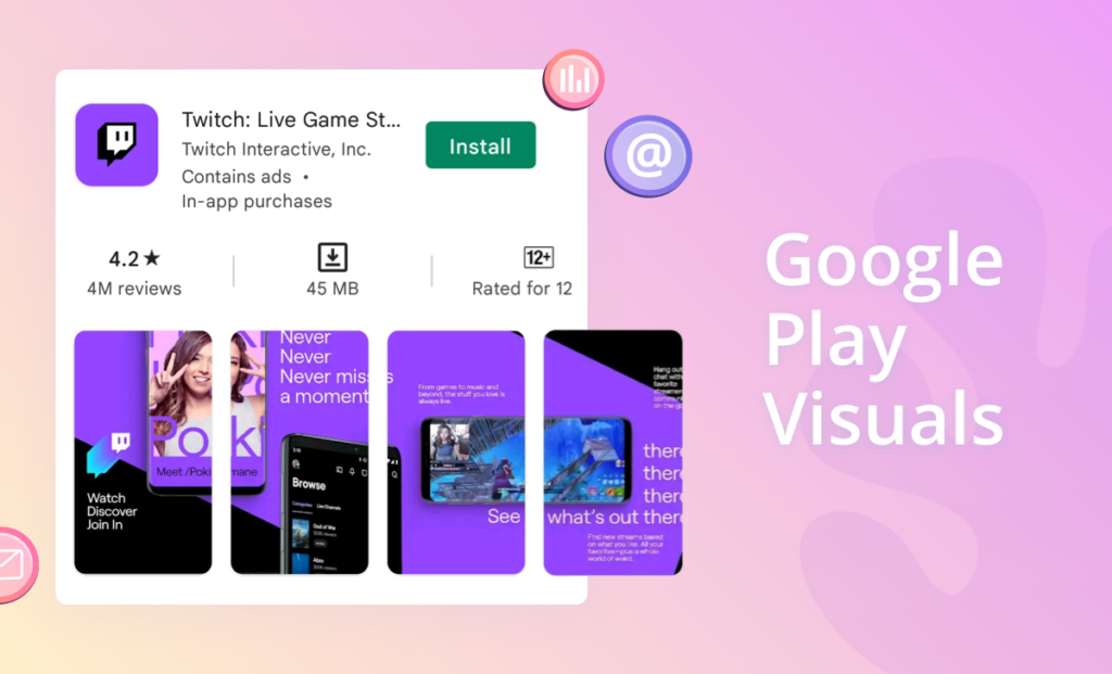
App Screenshots
Speaking in statistical terms, there are about 5% of Android users bothering to read the full app description before they decide to try or ignore your product – the majority prefer to rely on their visual perception. Seeking to know more about what your app does, what cool features it boasts, or how convenient it is, an average user will head straight for the screenshots, thus making their role critical for a successful ASO conversion. Pour every bit of ingenuity you can muster into designing your ASO pictures to make sure it is an opportunity you capitalize on in full.
Best ASO practices for impressive screenshots
Google Play Store screenshots are the most convincing action-triggering graphic elements of your product page. Here is how to make sure you are using these listing visuals to add genuine value to your app’s product page:
- Make the first screenshot most powerful. Seize your audience’s attention on the spot by showing them your most stunning and efficient screenshot. Let it be the image of the most valuable, one-of-a-kind app feature or an extraordinary gameplay moment.
- Do not overwhelm the user with information. By stuffing too much information into a screenshot, you risk confusing your user about what matters. Information that is too complex for us to process quickly is of little interest to users who like making their decisions on the go.
- Provide text support. Not all in-app features and in-game mechanics are easily recognizable, especially if they are innovative. Adding concise and readable text to your screenshots can go a long way in making your users more comfortable and ready to convert.
- Localize your screenshots to different markets. Learn what works best for each specific market you plan to enter with your app/game and push it. Translating your creative Play Store assets is just the beginning – you need to analyze the target market preferences in more depth to know what will make it click.
- Use screenshots to tell about your seasonal events. Are there any ongoing seasonal events that you want your users to know about? Advertise them with your seasonal screenshots! It will not only make your product look up-to-date and ever-evolving but also create a sense of urgency and exclusivity, which are both excellent selling points.
Google Play screenshot requirements:
- Number of screenshots allowed: up to 8.
- Size: between of 320 px and 3840 px.
- Format: JPEG or 24-bit PNG (no alpha); portrait or landscape.
What to avoid when designing product page app screenshots?
Below is a brief overview of the three most common mistakes many devs make when crafting Google Play screenshots:
- Using small fonts or big text blocks. It is simple: the text you put on your screenshot needs to be short and clear – otherwise, the majority of your users will not even be bothered to read it.
- Cramming too many ideas into a single screenshot image. It is enough to show one concept per screenshot or several screenshots if you manage to make them into a cohesive and gripping story.
- Leaving screenshot slots vacant. Try to use as many screenshots as the Google Play Store allows you to. Demonstrate your app/game from different flattering angles for a better chance to capture the user’s attention and score more downloads.
App Preview / Promotional Video
Video previews in the Google Play promo videos are a further opportunity for you to brief your audience on the most impressive benefits of your app or the niftiest features of your game. It is your chance to show how the product can be helpful in everyday life and why it is a better pick than the rest of the competition. At this point, the user is most likely already interested in trying your product and only needs one final push to make the decision to download.
To make sure it does exactly what it is supposed to do – increase engagement and boost your page view-to-install conversion rate – your short video must not only meet all necessary Google Play store video format requirements but also convey an impactful and memorable message addressing your users’ unique needs and innermost wants.
Best ASO practices for conversion-enhancing video previews/promo videos
We will cover all you need to know about making a great video preview/promotional video. Use the below recommendations to improve the performance of your Google Play product page:
- Test to see if your audience is interested in having a video. Users in some countries just do not have the habit of watching a promo video and prefer to rely solely on Android app screenshots. Researching your target market beforehand will thus help you save valuable time and resources.
- Make the best use of Google’s promotional capabilities with Feature Graphic. Google Play feature graphic is a vital first-impression ASO asset that plays a dual role: entice users to watch your promotional video and clearly express your product’s USP.
- Do not save the best for last. Start by laying out your key message to the user. You only have a few seconds to win the viewer’s attention and persuade them to download your product – use those wisely and do not put off your most compelling stuff till the very end.
- Choose text over voiceover. As good as quality voiceover is, there is always a chance that your video will be muted, and the viewer will not hear a word of it. Just to be on the safe side, consider including captions in your video to make it more accessible.
- Horizontal vs. vertical orientation: which way to go? If you create a preview video for an iOS product, Asolytics recommends adapting it to your gameplay orientation or app format. For Google Play apps, it is preferable to opt for landscape mode even if the product is vertical.
Google Play Store app promo video specs:
- Number of videos allowed: one promo video.
- Format: .mov, .mpeg4, .mp4, .avi, .wmv, .mpegps, .flv, 3GPP, WebM.
- Length: 30-120 sec.
- Resolutions: landscape YouTube URL video; 16:9 aspect ratio; at least 1920×1080.
- Requirements: only real-life use of the app; avoid depicting devices that are not Android.
- Feature Graphic: JPEG or 24-bit PNG (no alpha); 1024*500.
What to avoid when designing product page app videos?
To have your product well-accepted by your audience, there are a few typical mistakes to avoid while creating a Google Play app video:
- Putting off getting to the point. Not getting your viewers excited early on defeats the purpose of your video preview/promo video. Very few will want to linger around long enough to see the good stuff, so make the first five seconds of your video as engaging as possible.
- Ignoring the fact that the video is intended for small screens. Using too much text information, small fonts, and meaningless splash screens with the name of your brand – all this interferes with the user’s viewing experience in a major way, making it hard to get your message across.
- Not including a decent poster frame. The video thumbnails come in handy when app previews do not autoplay. Make sure to include an aesthetically compelling and well-optimized poster frame in your listings that effectively conveys your central message.
Wrapping It Up
It is not enough for your product page graphics to simply conform to the technical requirements imposed by the Google Play Store – they should also be unique and catchy to make your product stand out from thousands of same-niche games and applications. Go through the tips and tricks provided by the Asolytics team again and use the ones that best suit your ongoing ASO strategy.
Also, when working on your Google Play product page visuals, keep the following in mind:
- A/B test your changes. You can never be 100% sure which idea or approach will result in the highest conversion until thoroughly testing those. Play with app icon colors; try different orientations for your screenshots; compare preview videos to see what works best for your target audience. We have prepared a “How to A/B Test Icon Your App” guide for you.
- Study competitors. Monitor your competitors for inspirational ideas: explore how their visual style has evolved and analyze what strategies they adopt for their seasonal ASO.
- Be mindful of your user’s comfort. If you want your product page visuals to attract the user and facilitate downloads, make sure your screenshot images are clear, the text is easy to read, and the video has localized subtitles.
See other Asolytics tutorials and guides for more Google Play Optimization tips and strategies that you can utilize in 2022.